Getting patients to the right specialist faster
VirtualMD is an AI-powered health assistant that helps you understand symptoms, manage your family's health, explore medical topics and get personalized health guidance anytime, anywhere.
Product strategy
Mapping the AI health landscape and defining what VirtualMD should become.
Prototyping & testing
Exploring broadly in the solution space and testing with real users.
Iterating with feedback
Refining every interaction based on usability testing and clinical review.
Patients are stuck in a slow and misguided care path
76% of patients see a GP first when they actually need a specialist. The average specialist wait is 26 days. This is the space VirtualMD needed to fill and the product we inherited wasn't filling it.
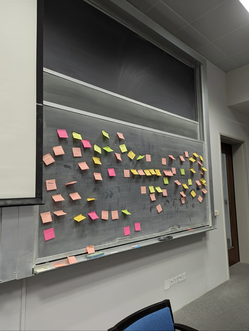
The primary action, buried at the bottom.
Below the fold for most users.

Decorative greeting. No way to type a reply.
It looked like a chat but It wasn't.
Four cards, same weight. Where do you start?
Nobody clicked. Everyone hesitated.
Decorative greeting. No way to type a reply.
It looked like a chat but It wasn't.
Four cards, same weight. Where do you start?
Nobody clicked. Everyone hesitated.
The primary action, buried at the bottom.
Below the fold for most users.
An experience that buried the core patient journey
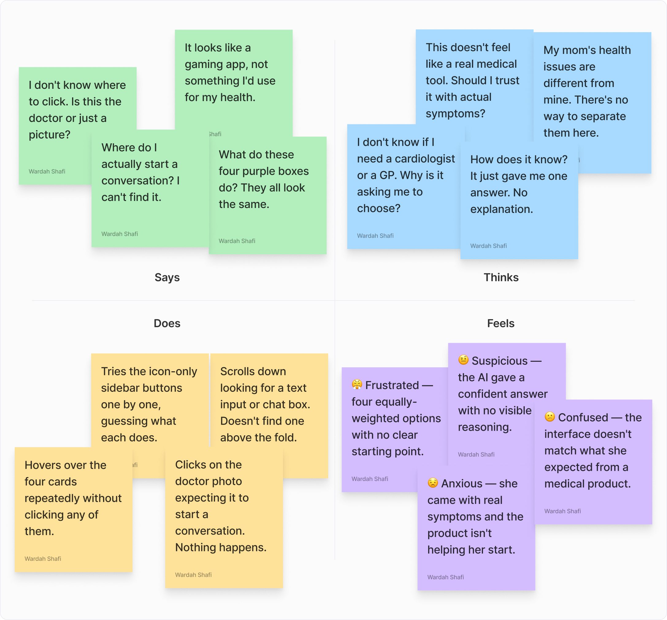
So we talked to the people who live this every day
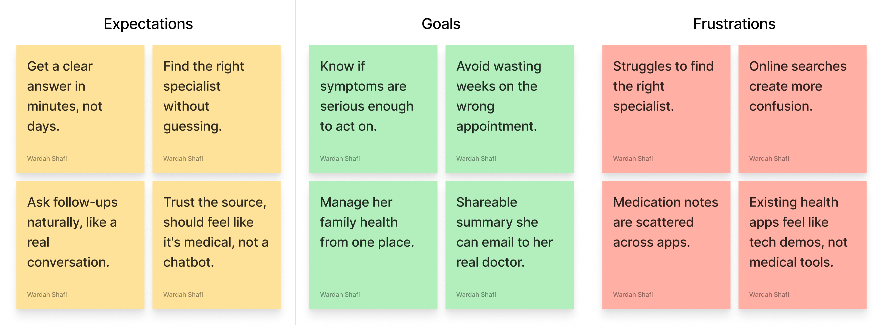
12 user interviews. Empathy mapping. Journey mapping. The same pattern kept surfacing: people don't need more options, they need the right one.

...I don't know if I need a cardiologist or a GP. Why is it asking me to choose?
The research made one design principle obvious: never make the user choose what they don't know.
What does it feel like to use a product you don't trust?
We mapped what Sarah said, thought, did, and felt during her first session with the old design. The gap between what the product offered and what she needed to feel safe became the redesign brief.
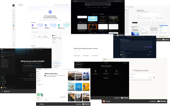
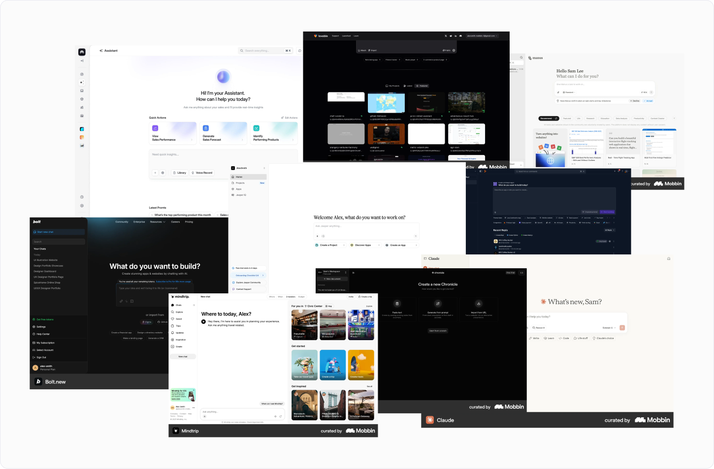
We audited the AI landscape
Different AI chat tools give single confident responses with no visible logic. That blind spot became our entry point.
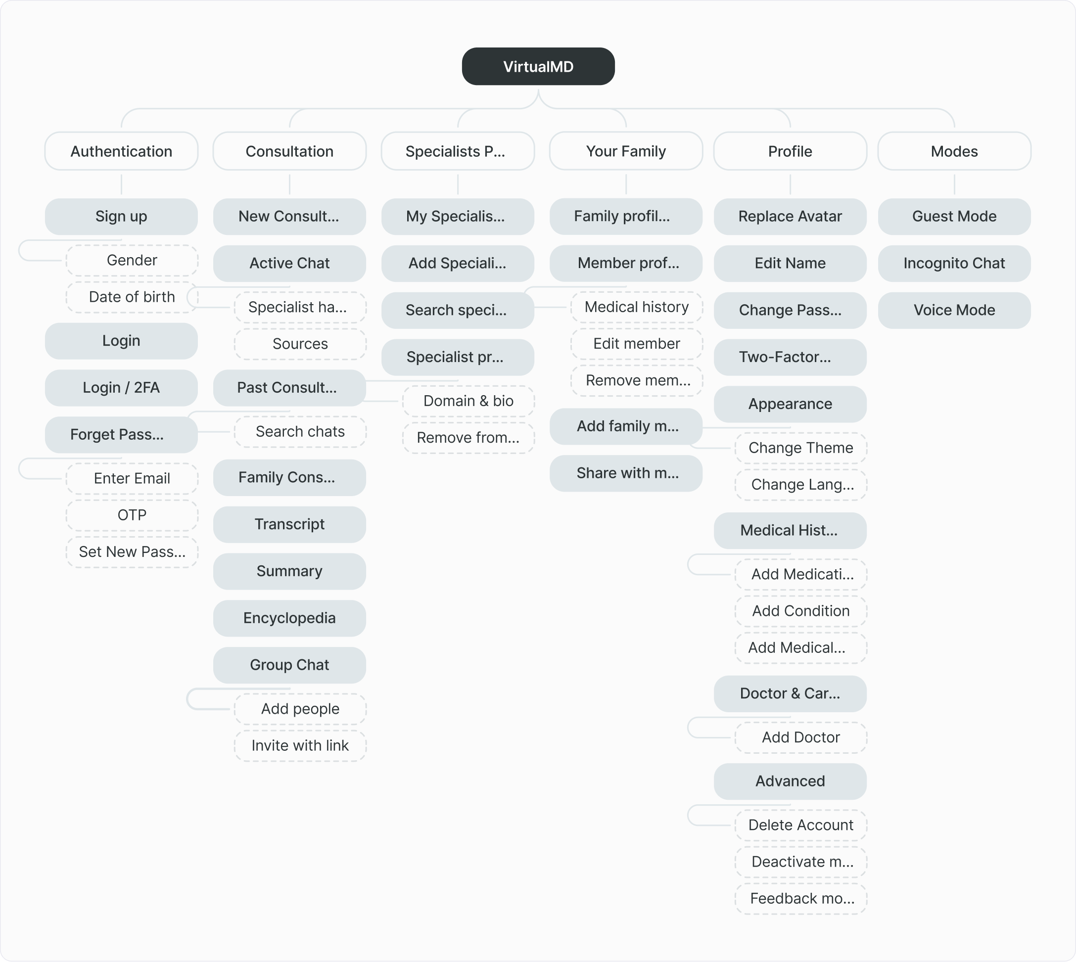
We mapped the product structure before designing the interface
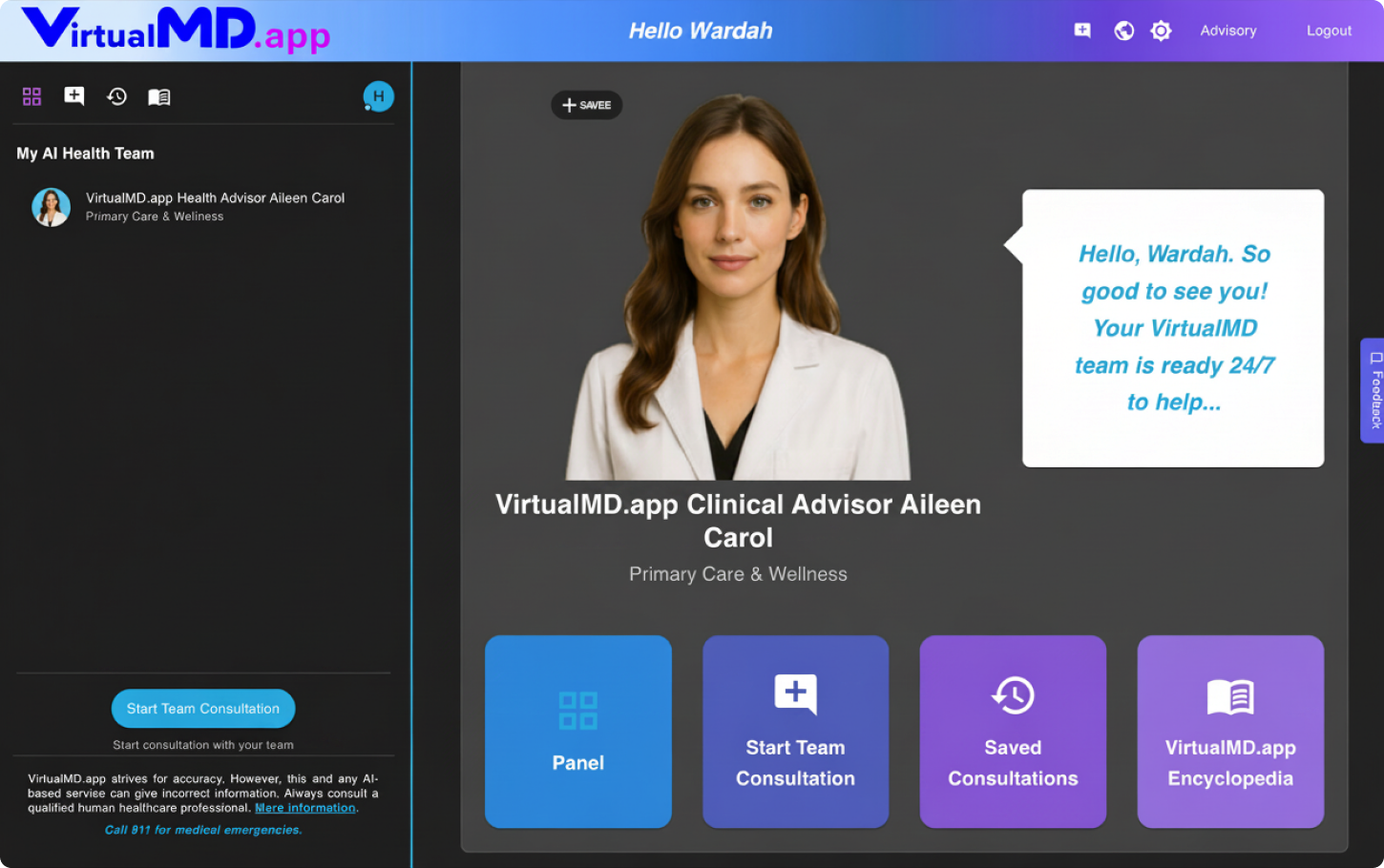
The platform was organized around patient goals, making consultations, specialists, profiles, and medical history easier to navigate.
Flexible entry paths for different user intents
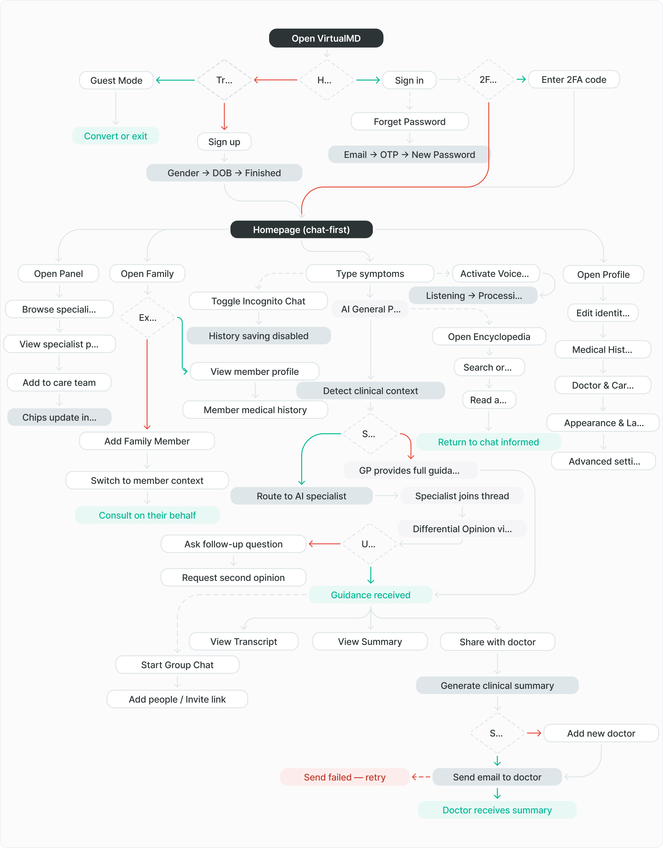
We mapped every path from entry to outcome
The golden path runs center — type symptoms, get routed, receive guidance, share with doctor. Five branches handle authentication, family, modes, and error recovery.
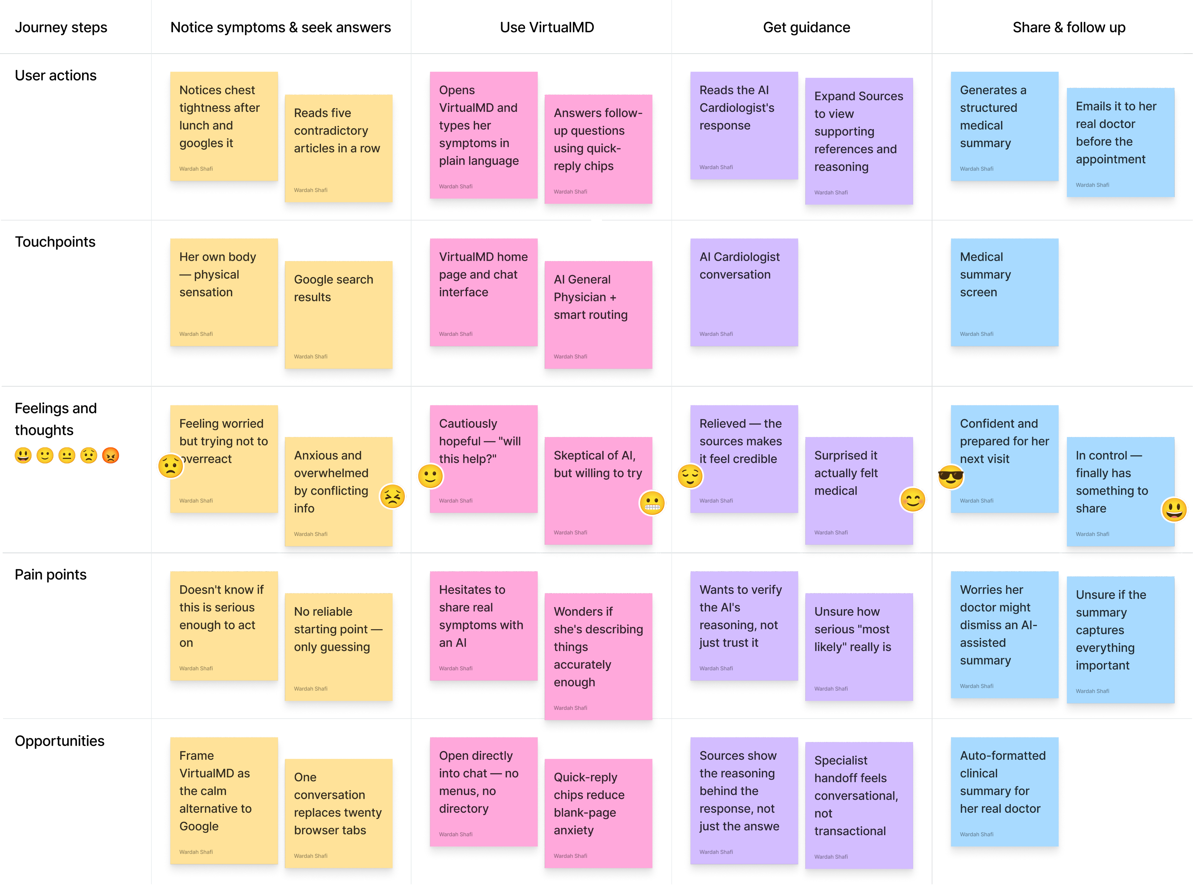
Sarah's journey — from the first symptom to the doctor's office
38. Marketing manager. Two kids. Elderly parents in another state, she's the one who has to figure out what to do next — usually with little time and no medical background.
...the design didn't make the AI smarter. It made the AI legible.
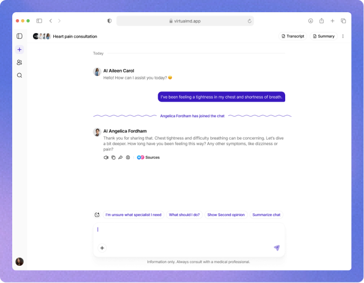
Each AI response shows three possible causes ranked by likelihood — updating per-message as new symptoms emerge. Trust built through transparency, not confidence.
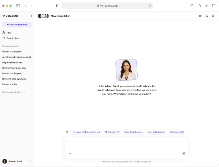
A consultation that starts with a question not a menu
Chat-first. Describe what you feel. The system figures out who you need. The prototype below walks through all five feature systems from the first symptom to the doctor's email.